The Curry Project
OVERVIEW
Branding
Logo Design
Packaging
GREAT INDIAN TASTE
The Curry Project is an Indian Cloud Kitchen based out of New Delhi. Food in India is like a religion, specially in North India. A few keywords that described the brand were: INDIAN, RICH & COLOURFUL, BOLD & LOUD. With that being said, it was quite simple to crack the design language and identity for this brand.
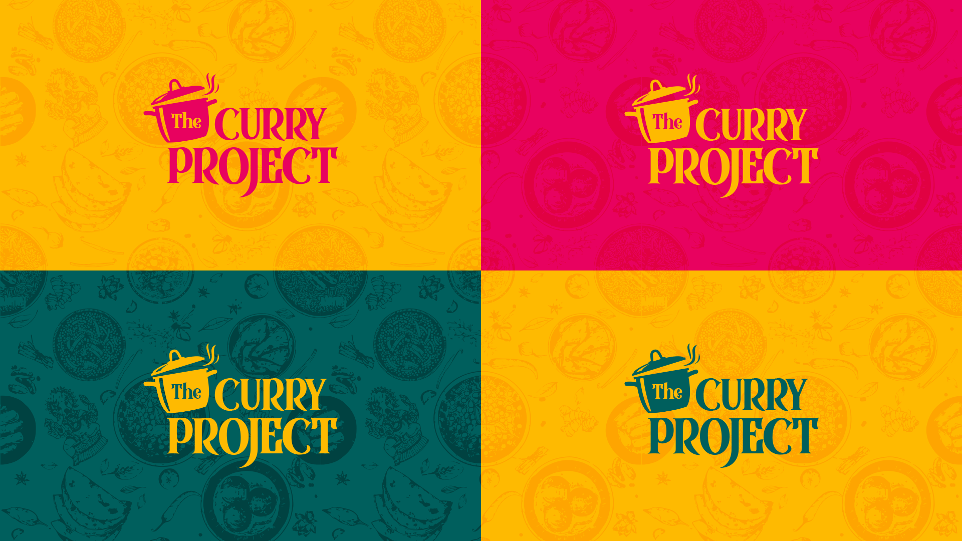
The name itself suggests “Curry” and the life of an Indian household revolves around a “Curry Pot” which was the best representation as an icon for the brand. Simple use of a curry pot silhouette along with some balanced composition of typeface has resulted in a clean, minimal looking logo.
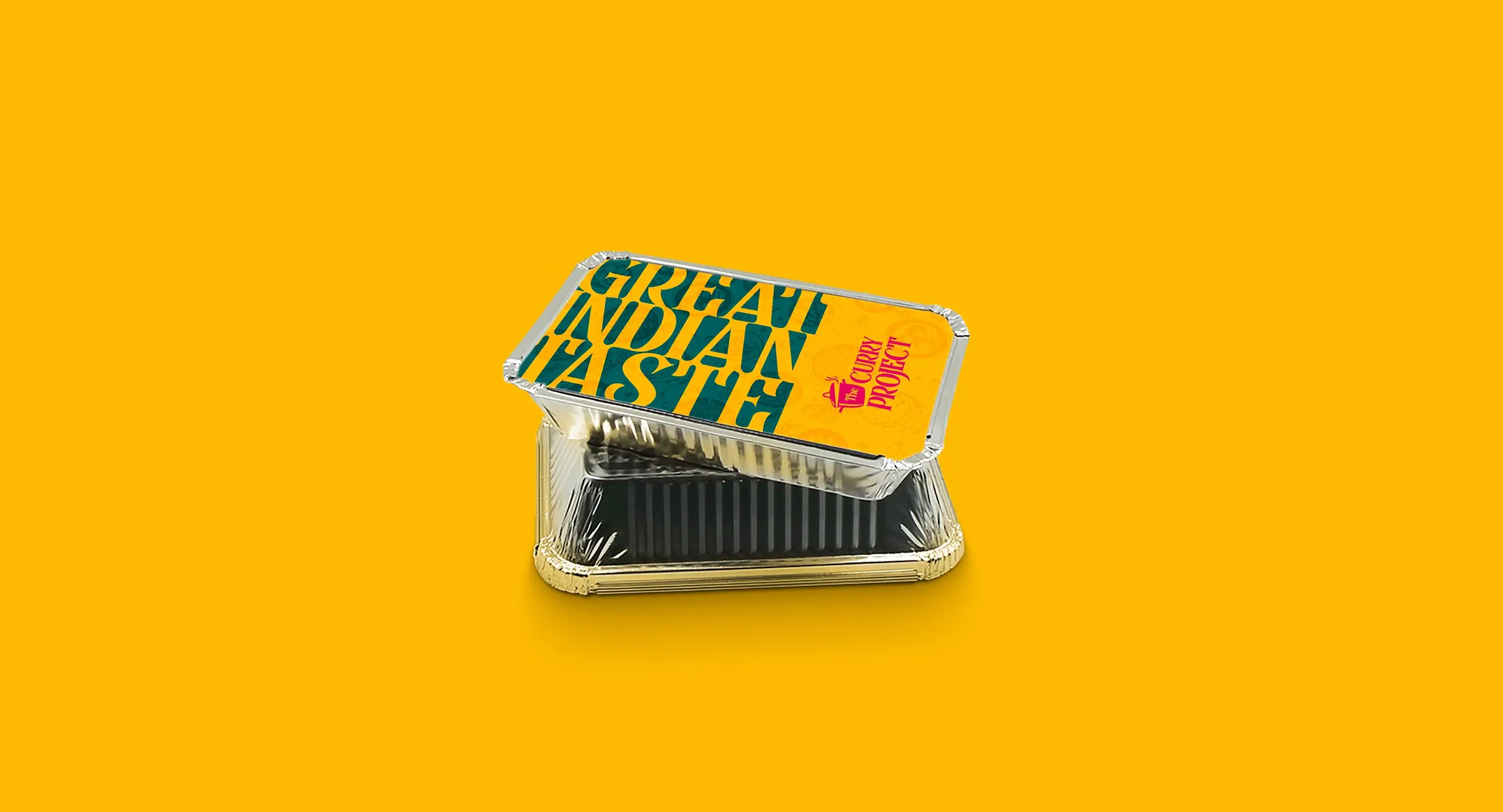
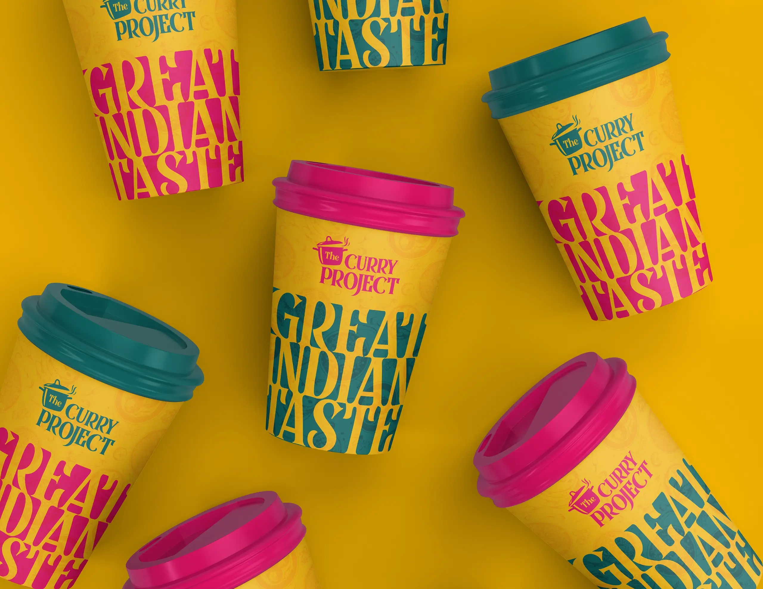
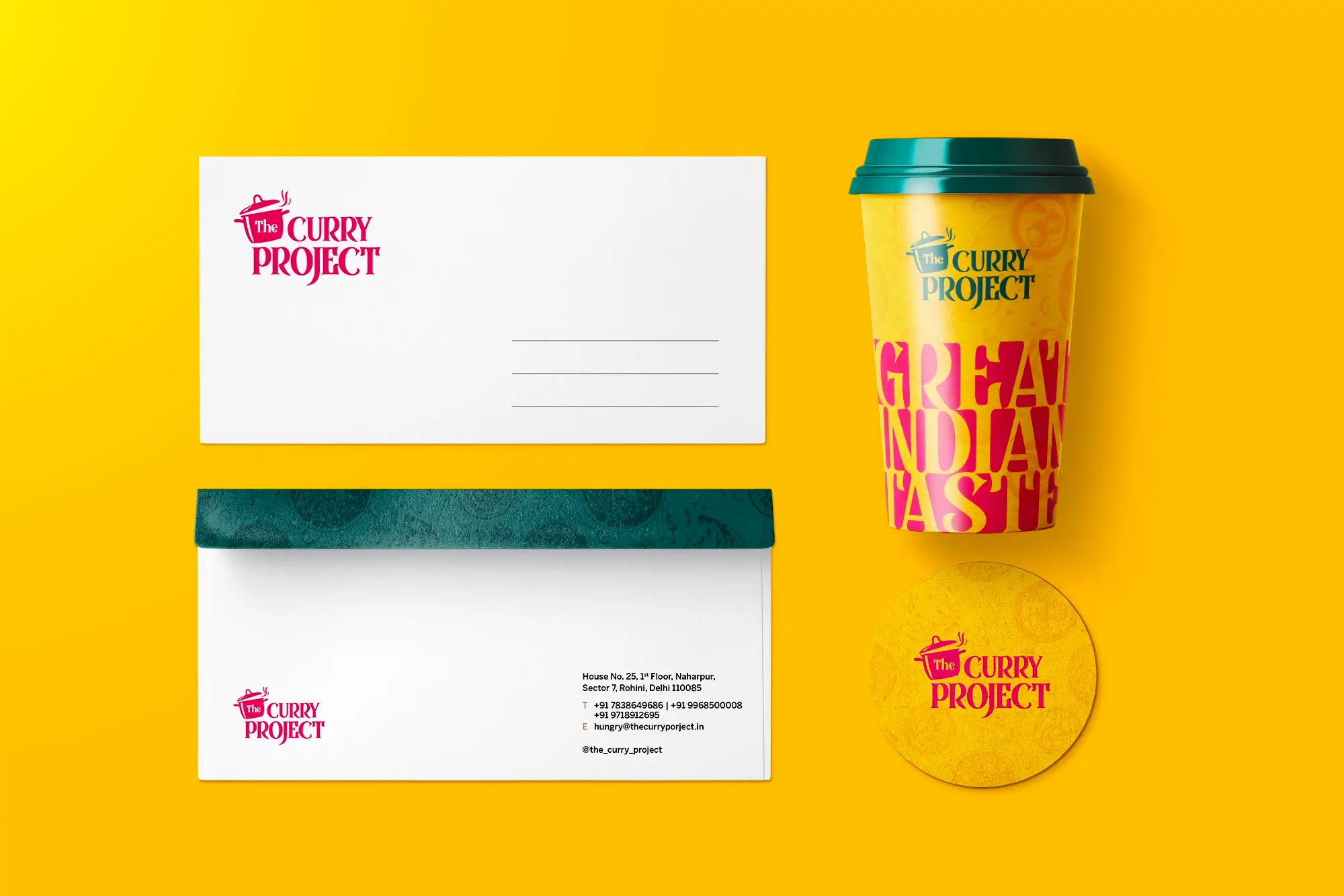
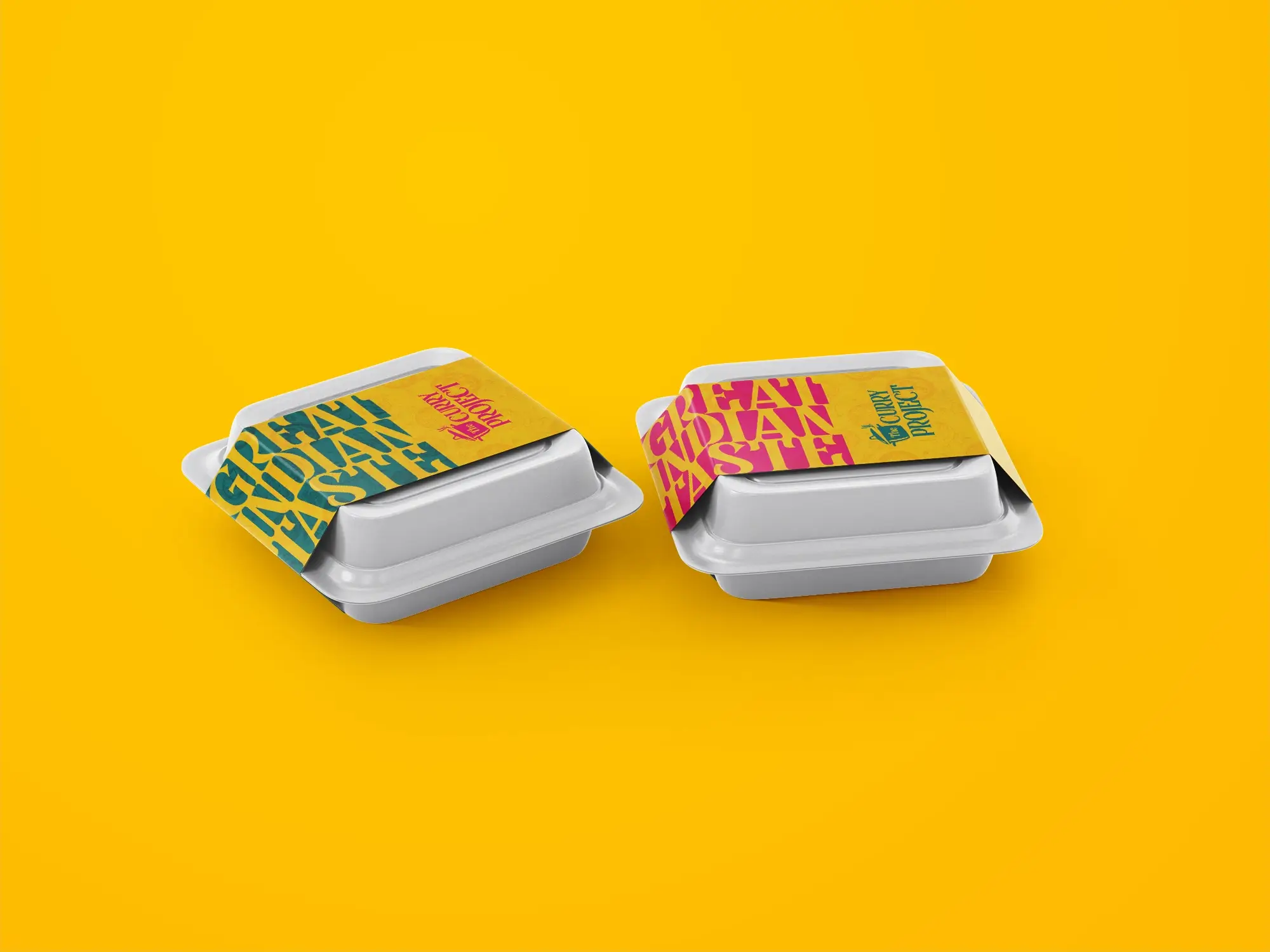
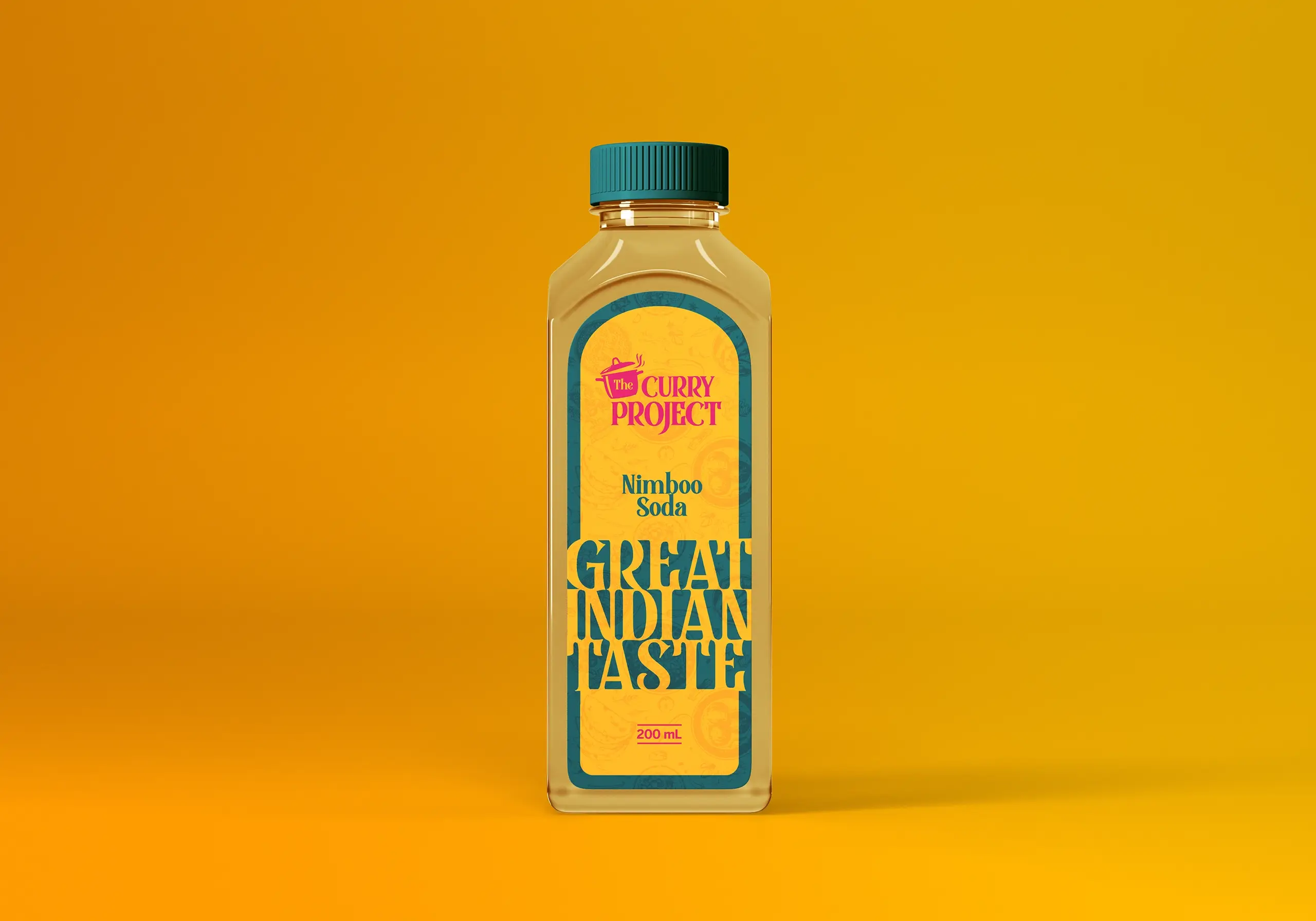
To make it stand out, the packaging needs to be vibrant & contemporary along with the right communication.
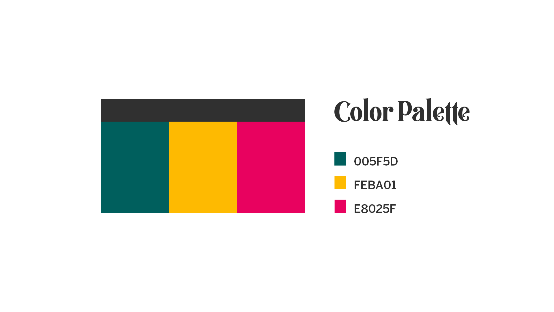
Keeping in mind the latest design trends that have now resurfaced, the art was given a loud and bold look supported by big sized typography and contrasting colours.
