OVERVIEW
Branding
Logo Design
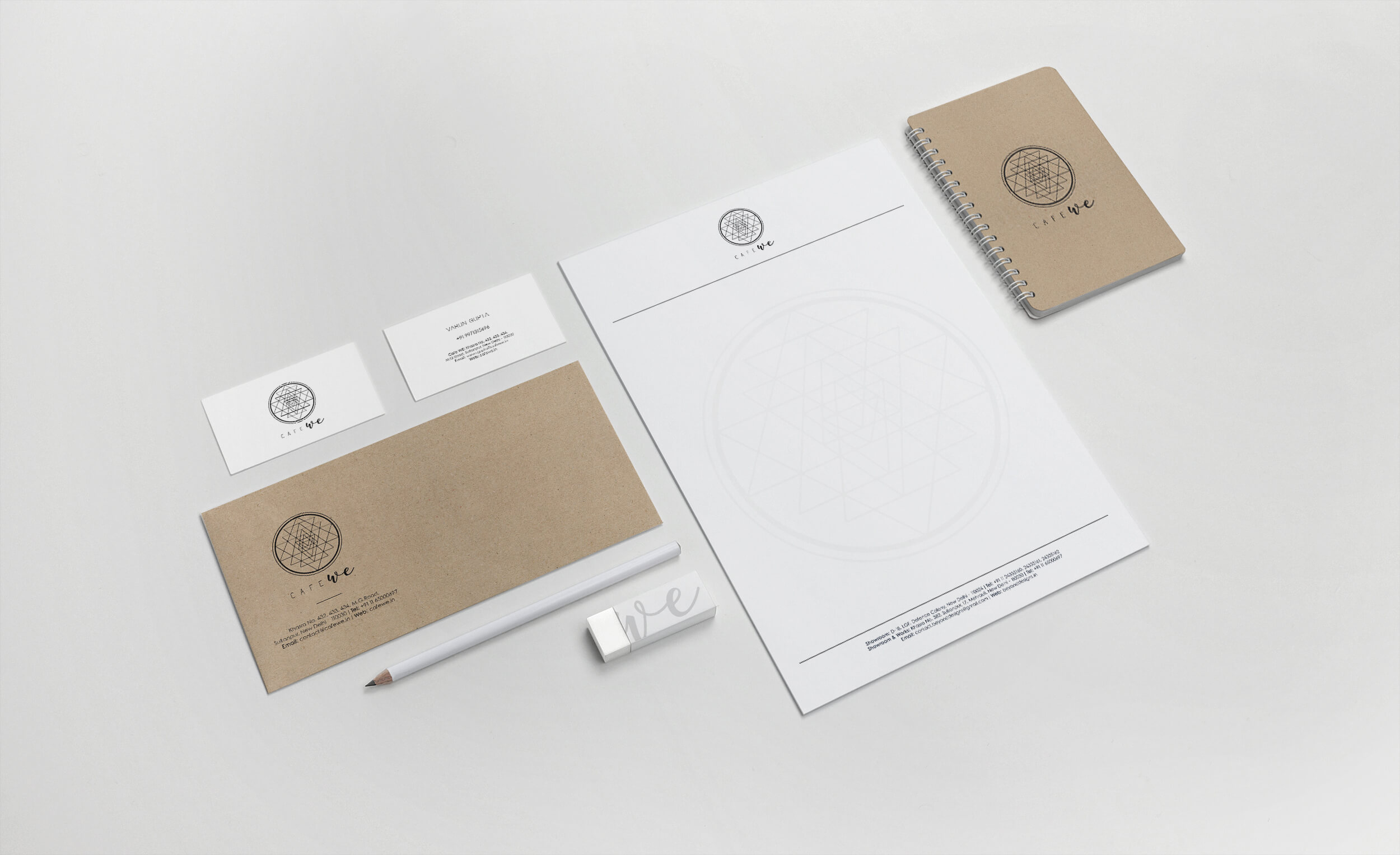
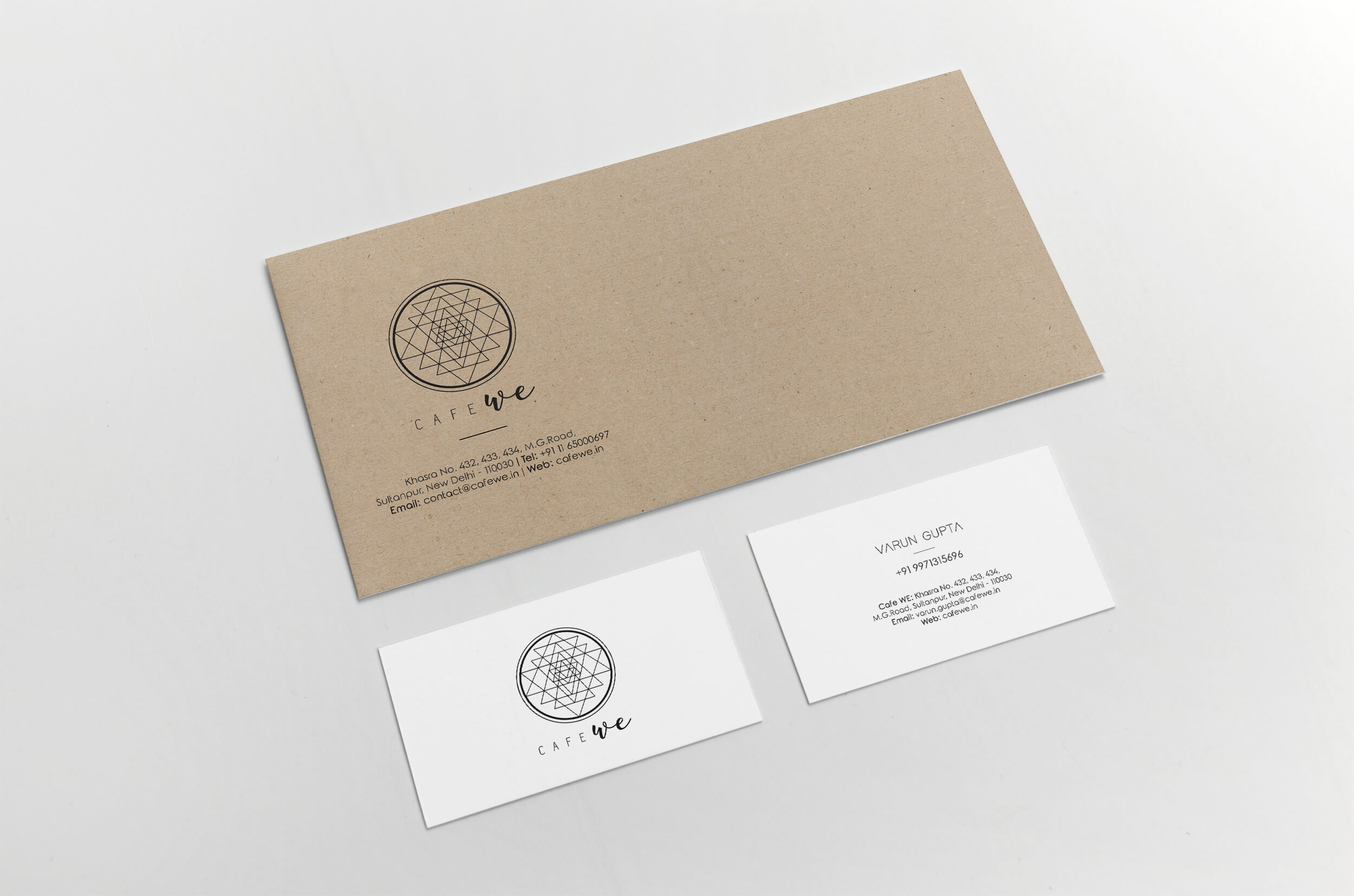
Stationary
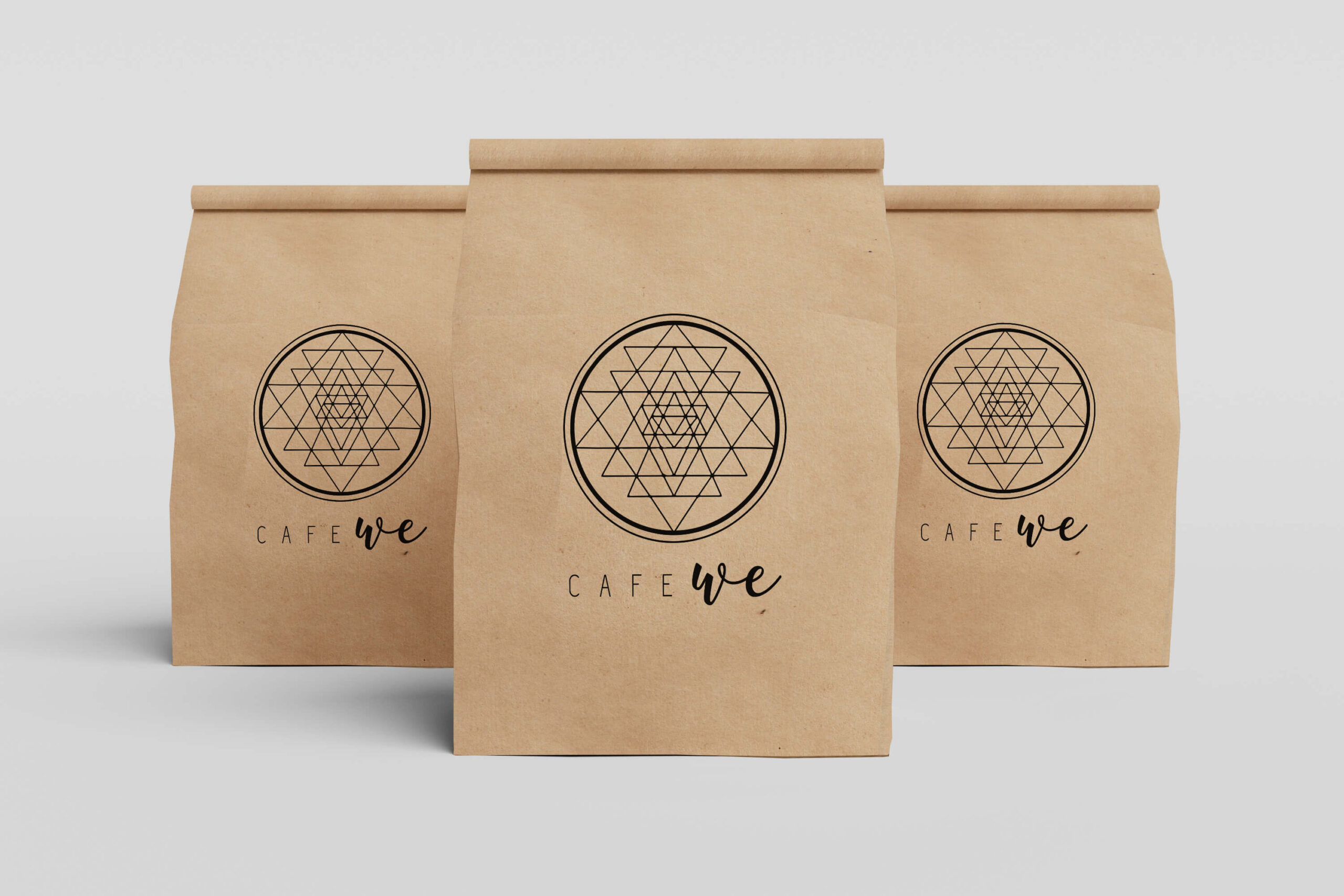
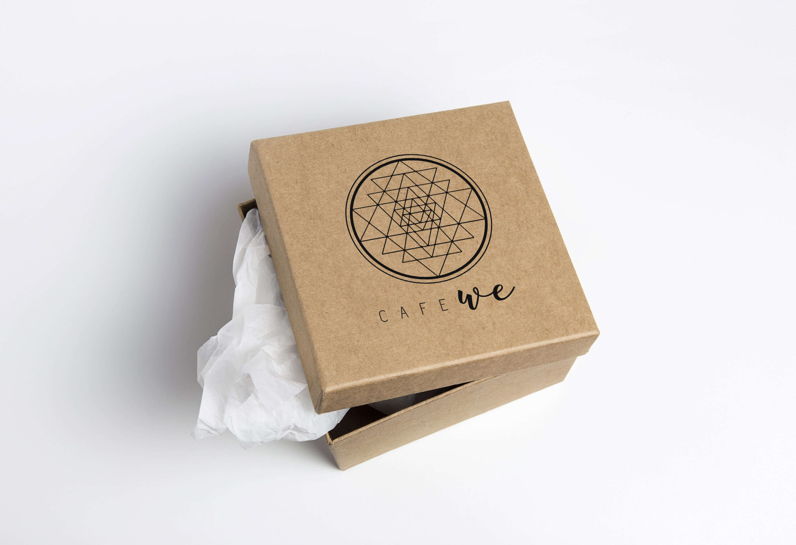
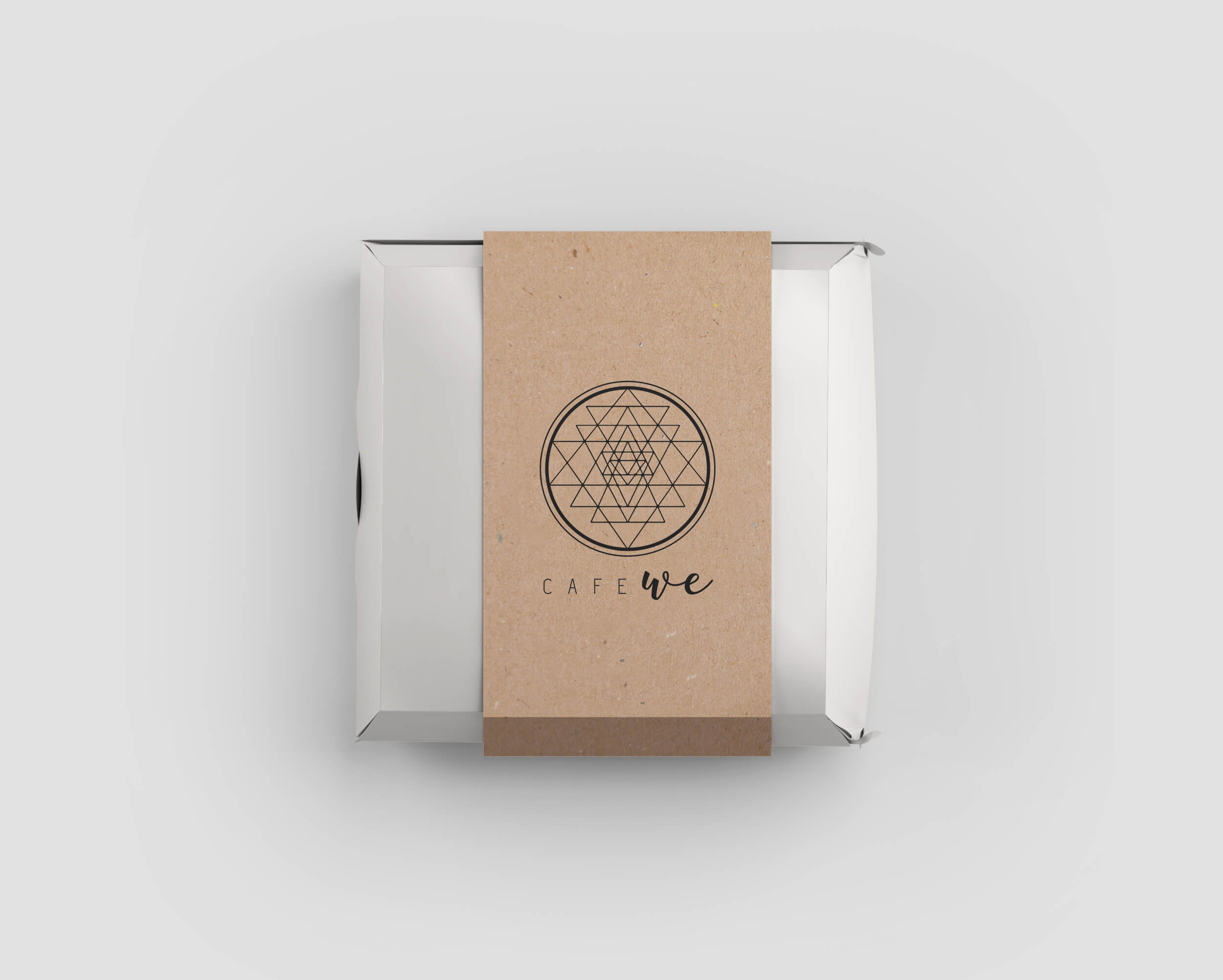
Packaging
Menu Design
LUXURY DOESN’T SHOUT, IT WHISPERS.
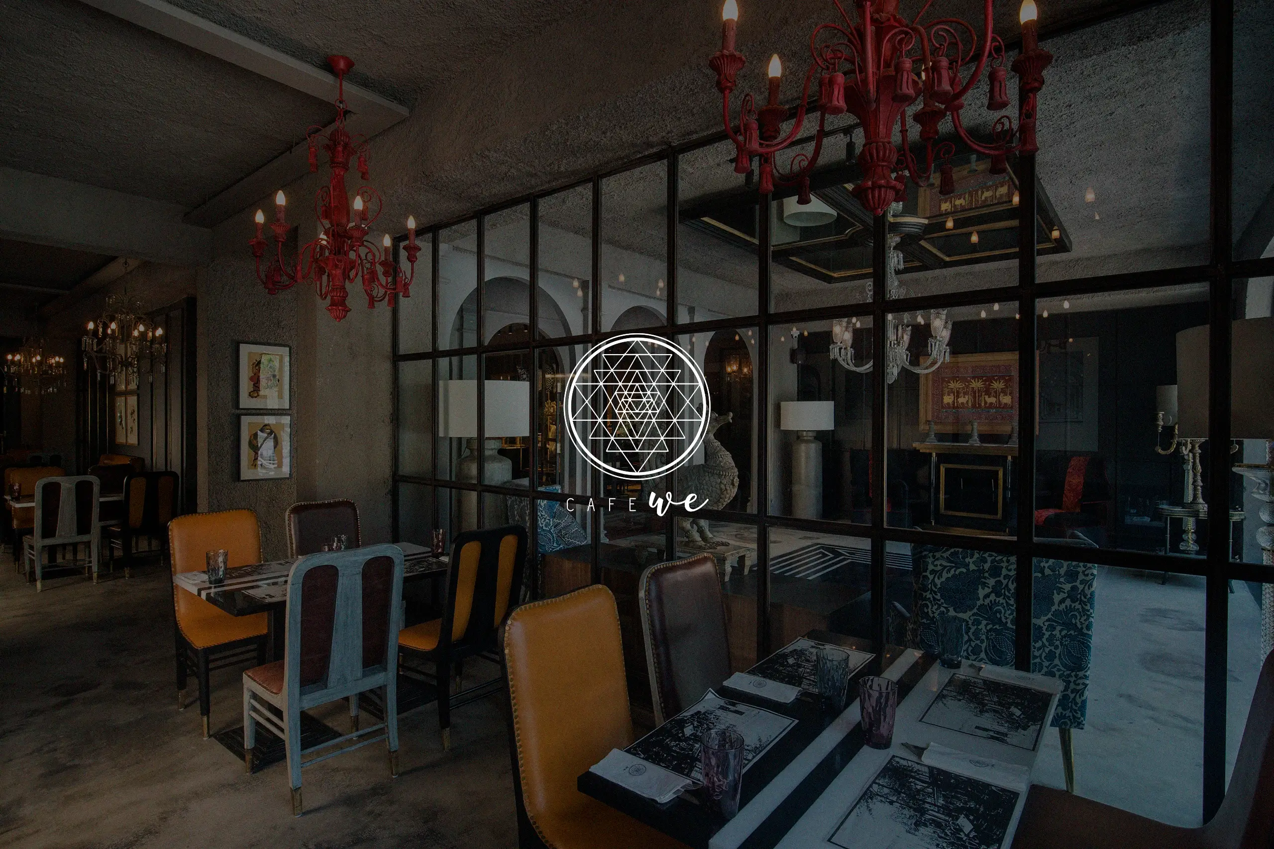
Café WE is a contemporary fine-dine restaurant based in New Delhi, envisioned as a space where tradition meets refinement. The vision was to craft a brand identity that feels elevated and premium, yet still rooted in the warmth and familiarity of Indian cuisine.
The goal: To create a clean, minimal, and high-end design language that reflects the sophistication of the space and the richness of its food offerings.
At the heart of Café WE’s identity lies a philosophy of quiet confidence. Rather than relying on ornate or overly traditional motifs, the brand was built around minimalist forms, intentional spacing, and refined type choices.
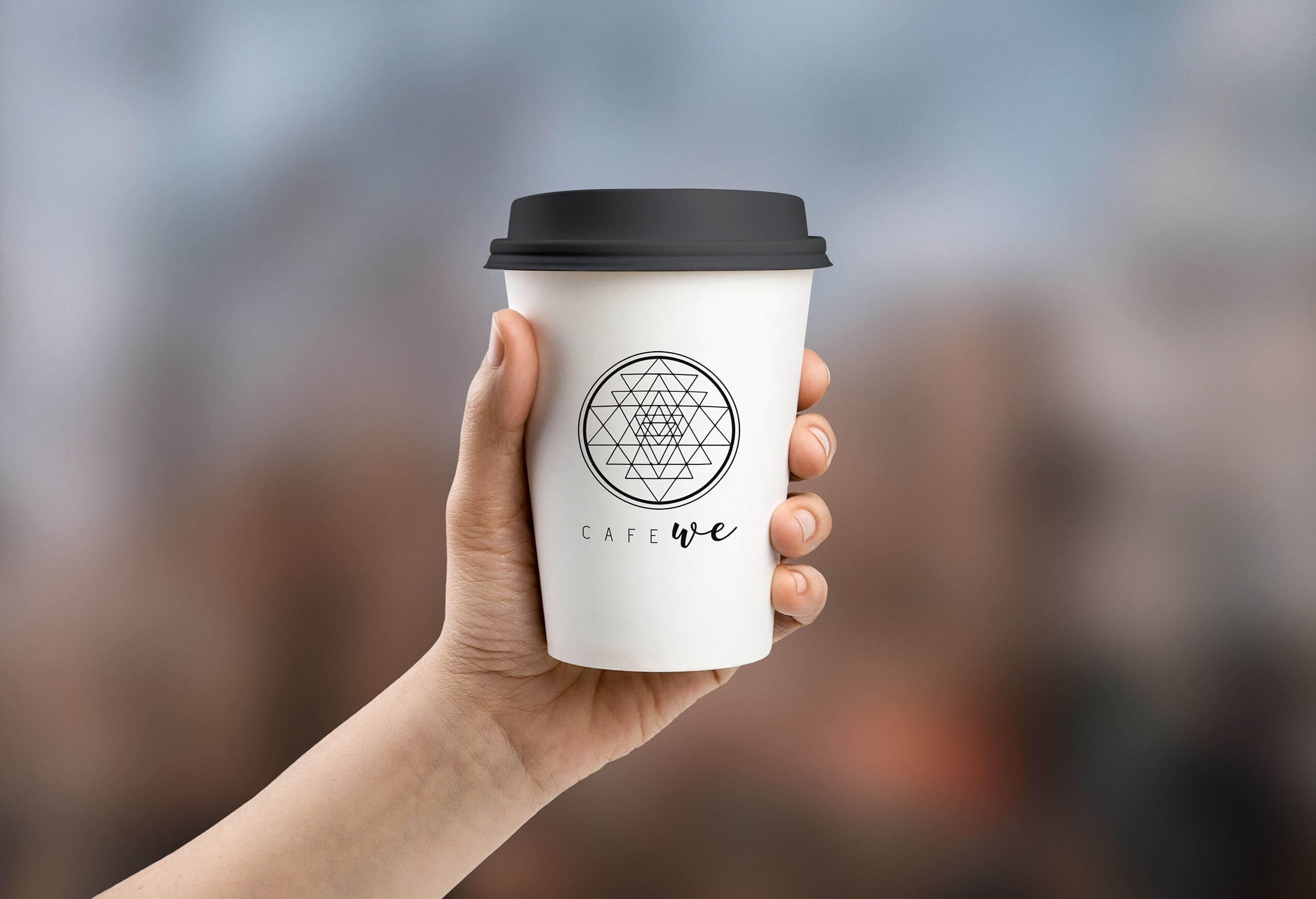
Logo Design: The logo distills the essence of the restaurant’s identity into a clean, modern mark. With a focus on symmetry and balance, the design communicates trust, professionalism, and elegance. The understated icon hints subtly at Indian culinary roots without being literal or loud.
Typography & Color: A neutral color palette combined with contemporary type choices elevates the overall aesthetic. The design avoids clutter, allowing each element, whether it’s the name, the logo, or menu items, to breathe and speak for itself.
Fine-Dine Visual Language: Every visual decision, from packaging to print materials, was made to support a refined dining experience. The brand speaks in muted tones, crisp lines, and curated compositions that reflect both precision and hospitality.